
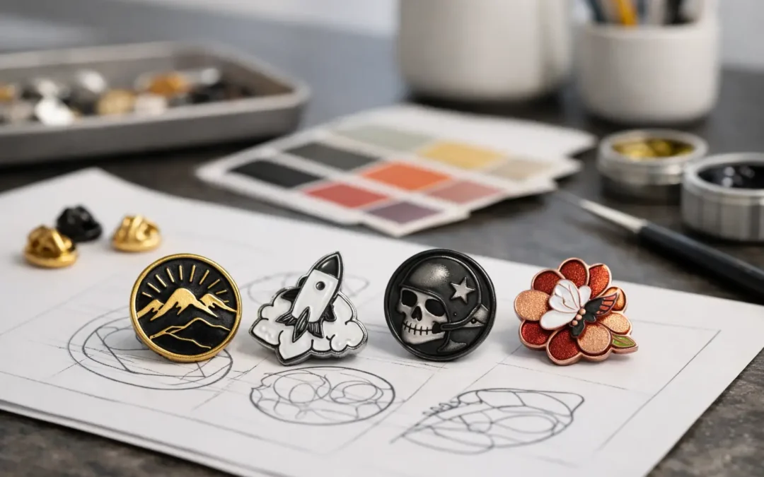
A pin can carry a logo, celebrate a milestone or bring a whole team together, but the wrong finish can make even strong artwork look flat. Knowing how to choose pin finishes helps you match the final look to your brand, audience and budget before production begins.
For a corporate recognition badge, a polished gold or silver finish may feel right at home. For a heritage club, an antique metal treatment can add character and depth. For a colourful event giveaway, bright enamel and a clean plated edge may create the strongest impact. The best choice is not simply the most expensive one – it is the one that supports the job your pin needs to do.
Start with the Purpose of Your Pin
Before comparing metal colours or enamel styles, consider where the pins will be used. A premium anniversary pin worn on a blazer has different requirements from a fundraising pin sold at a school fete or a high-volume conference handout.
Pins intended as awards, staff recognition or executive gifts usually benefit from a more refined finish. Shiny gold, polished silver, black nickel or antique metal can make the item feel considered and lasting. If your pin is part of an event pack, campaign or membership drive, colour visibility and price may take priority. A printed pin with an epoxy coating can reproduce detailed artwork efficiently, especially where a logo contains gradients, fine text or several colours.
Also think about how often the pin will be handled. A finish for a presentation box can focus on visual impact, while a pin designed for regular wear needs to remain neat after being clipped onto uniforms, lanyards, jackets and bags.
How to Choose Pin Finishes That Suit Your Artwork
Your artwork should lead the decision. Metal finishes are not just background details – they frame the design, define raised lines and change how colours are perceived.
Shiny metal finishes for a clean, premium look
Polished gold and polished silver are popular choices for corporate logos, award pins, commemorative designs and formal occasions. Their reflective surface catches the light and creates a crisp contrast around enamel areas. Gold can add warmth and prestige, while silver often feels modern, neutral and versatile.
A shiny finish works particularly well when your design has simple shapes, strong colour blocks and clear metal outlines. It can be less suitable for very detailed artwork where reflections may compete with small design features. If your logo uses pale yellow, light grey or metallic-looking colours, request a digital proof to check that the plating and enamel remain clearly separated.
Black nickel is another polished option with a sharper, contemporary feel. It makes bright colours pop and can suit music events, gaming designs, black uniforms, modern retail brands and bold promotional campaigns. Keep in mind that dark plating can make tiny recessed details harder to read if the artwork is already dark.
Antique finishes for depth and character
Antique gold, antique silver, antique copper and antique brass are designed to bring out texture. The darker treatment settles into recessed areas, making raised features more visible. This is an excellent option for die-struck pins, 3D designs, heritage logos, commemorative medallions and club badges with detailed linework.
Unlike a bright polished finish, antique plating is intentionally less reflective. It feels established and tactile rather than glossy. That makes it ideal for historical societies, service awards, sporting clubs with long traditions and fundraising pieces that need a collectable feel.
Antique finishes are usually strongest when the design relies on metal detail. If your pin is packed with bright Pantone-matched enamel colours, a clean shiny plating may offer a more contemporary result. It depends on whether you want the metalwork or the colour to take centre stage.
Matte and textured finishes for understated branding
A matte or sandblasted metal surface reduces glare and gives a pin a softer, more understated appearance. This can be a smart fit for premium brands that avoid a flashy look, as well as outdoor organisations, education providers and understated corporate merchandise.
Texture can also help a simple logo feel more substantial without adding extra colours. A matte background with polished raised lines, for example, creates contrast through light and surface rather than enamel alone. This approach can look particularly effective on larger pins where there is room to appreciate the detail.
Because matte surfaces reflect less light, they may not suit every small design. On a compact badge, a polished finish can sometimes make fine features appear clearer from a distance.
Choose the Enamel Surface Before Finalising the Finish
The enamel style changes the overall feel of your pin just as much as the metal plating. It is worth deciding on both together rather than treating them as separate choices.
Soft enamel pins have recessed colour areas and raised metal borders. The texture is easy to feel, giving the pin a traditional, dimensional look. They are a strong all-round choice for logos, club badges, school pins and promotional designs where clear outlines matter. An optional epoxy coating can add a smooth, protective dome over the surface, though it also changes the tactile feel and adds a glossy appearance.
Hard enamel pins are filled and polished until the colour sits level with the metal lines. The result is smooth, durable and refined. This finish suits premium membership pins, employee awards, retail merchandise and designs that need a high-end presentation. It generally costs more than soft enamel, so it is best used where the additional polish supports the purpose of the order.
Printed pins are the practical answer for highly detailed artwork. Photos, gradients, tiny lettering and complex colour transitions can be reproduced more accurately than with enamel. A clear epoxy coating is commonly used to protect the print and provide a smooth finish. Printed pins may not have the same raised metal texture as enamel, but they offer excellent design flexibility and can be very effective for campaigns and event branding.
Match the Finish to Your Brand Colours
Close Pantone colour matching helps maintain brand consistency, but the surrounding metal still affects the way colours appear. Warm plating such as gold, brass or copper can soften cool colours and make reds, oranges and yellows feel richer. Silver and nickel are more neutral, making them a safe choice for a broad range of palettes. Black nickel creates high contrast with white, bright blue, lime green, pink and vivid red.
If your organisation has strict brand guidelines, share the relevant colour references and approved logo files early. This gives the production team the best chance to identify fine lines, small text or colour combinations that may need minor adjustment for pin production. A free digital proof is the moment to check these details carefully, not just confirm that the logo is present.
Look closely at the proof at the actual pin size. Artwork that looks clear on a computer screen can become crowded at 20 mm or 25 mm. Increasing the pin size, simplifying small text or selecting a printed finish may produce a better real-world result than forcing every detail into an enamel design.
Balance Budget, Quantity and Perceived Value
The ideal finish is often a commercial decision as well as a design one. For larger quantities, a straightforward soft enamel pin with shiny plating can deliver strong visibility at an affordable unit price. This makes it well suited to community events, schools, charities, campaigns and large staff groups.
For smaller runs, VIP gifts or milestone awards, investing in hard enamel, antique plating, 3D detailing or a presentation box can lift perceived value. The pin becomes something people keep rather than a giveaway that disappears into a drawer.
There is no universal rule that one finish is better. A bold, well-designed printed pin can be more effective than an overcomplicated premium pin if it is made for a busy event. Equally, an antique die-struck pin can say more about a centenary celebration than a glossy full-colour design ever could.
Consider Attachments and Presentation Too
A quality finish deserves an attachment that suits the way people will wear it. Butterfly clutches are common for lightweight promotional pins and are easy to use. Rubber clutches can provide a comfortable, secure option, while magnets avoid piercing clothing and work well for some uniforms or corporate settings. Larger or heavier pins may need more than one attachment point to stop them rotating.
Presentation also shapes the final impression. A pin handed over in a simple backing card works well for retail sales, fundraising and event packs. A velvet-style box or gift box can turn the same pin into a meaningful service award or executive gift. If the pin marks achievement, membership or years of service, the packaging should reinforce that message.
A good pin finish does more than look attractive in a proof. It should suit the artwork, feel right for the occasion and arrive ready to make an impression. When you are unsure, provide your logo, intended quantity and event date, then let an experienced pin supplier guide you towards the finish that gives your design the impact it deserves.