
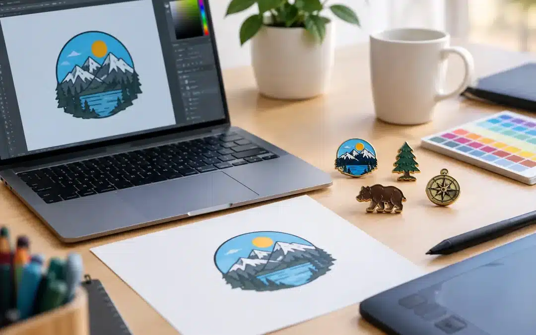
A great lapel pin starts long before production. It starts with artwork that clearly shows what you want made. This custom pin artwork file guide explains how to prepare your design so the finished pins look sharp, carry your brand colours accurately and move through proofing without unnecessary delays.
Whether you are ordering membership pins for a club, staff recognition badges, school house pins, charity merchandise or event giveaways, clean artwork helps achieve a polished result. You do not need to be a graphic designer to get it right. You simply need to understand what information the production team needs and where small details can make a big difference.
Start with the pin style, not just the logo
Your artwork should suit the type of pin you are ordering. A detailed logo may look excellent as a printed pin with an epoxy coating, while a simple, bold design can be ideal for die-struck soft enamel or hard enamel. If you are planning an acrylic or PVC pin, different production methods allow for different levels of detail, texture and colour treatment.
This matters because a lapel pin is small. A design that works beautifully across a banner, brochure or vehicle decal may need simplifying when it is reduced to 25 mm or 30 mm. Fine lines, tiny lettering and closely spaced colour areas can become difficult to reproduce cleanly in metal enamel.
Before finalising your file, consider the pin’s intended size, shape and finish. A round pin gives a very different result to a custom-shaped badge that follows the outline of a mascot, product or logo. If your design includes a border, make it deliberate and even. If it includes text, make sure it remains easy to read at the actual pin size, not only when enlarged on a computer screen.
Custom pin artwork file guide: the best file formats
Vector artwork is the preferred starting point for most custom pin orders. Vector files are built from editable lines and shapes rather than fixed pixels, so they can be resized without becoming blurry. Common vector formats include AI, EPS, PDF and SVG.
A print-ready PDF can also work well, particularly when it contains vector elements and embedded fonts. If your designer supplies a logo package, ask for the original AI or EPS file where available. These files make it easier to identify separate colours, clean up edges and create an accurate digital proof.
High-resolution PNG, JPEG and TIFF files can still be useful, especially for printed pins or when no vector file exists. For best results, provide the largest, clearest version you have. A tiny image copied from a website or social media profile may look acceptable on screen but often loses detail when enlarged for production.
If all you have is a low-resolution image, send it through anyway. An experienced pin supplier can assess whether it is workable, recommend a better pin style or help redraw simple artwork. It may involve additional design work, but it is better to resolve that early than approve a proof based on unclear source material.
Keep lines, text and details production-friendly
The most effective pin artwork uses strong shapes and clear separation between elements. For enamel pins, raised metal lines divide the coloured sections, so every tiny element needs enough room to be made cleanly. A very thin white gap between colours, for example, may disappear or need to become a metal line.
Text is one of the most common trouble spots. A slogan, event date or organisation name can add meaning, but it needs to be readable at pin size. As a general rule, avoid cramming long sentences onto a small badge. Consider using an abbreviation, initials or a simplified mark on the pin, then placing full details on the backing card or presentation box.
Logos with fine gradients, shadows or photographic detail are another case where the right production method matters. Enamel pins work best with solid, separated colour areas. Printed pins are more suitable for gradients, intricate illustrations and fine lettering. There is no single best option. It depends on the artwork and the visual result you want.
Supply colour information wherever possible
Brand colour accuracy is especially important for corporate campaigns, sporting clubs, schools and established organisations. If your artwork uses specific brand colours, include the relevant Pantone references with your file. Pantone matching provides the clearest production reference for enamel and printed colours.
CMYK or RGB values are also useful if Pantone colours are unavailable, although screens, printers and materials can display colour differently. A navy blue viewed on a mobile screen may not look identical once it is produced in enamel or printed on acrylic. Providing an approved brand guide, previous merchandise sample or clear Pantone reference reduces guesswork.
For a simple one-colour die-struck pin, specify the preferred metal finish too. Antique gold, antique silver, shiny nickel, black nickel and copper can all change the character of the same design. A heritage-style emblem may suit antique metal, while a modern awards program may call for a bright polished finish.
Include the details that do not appear in the artwork
Your design file shows the visual direction, but a quote and proof also need practical production details. Include the approximate quantity, preferred size, pin style, metal finish and attachment type. A standard butterfly clutch is a popular choice for lapel pins, while magnets can be better for staff uniforms where you want to avoid piercing fabric.
It also helps to state where and how the pins will be used. A large commemorative pin for a presentation event may benefit from a heavier feel, a custom backing card and a gift box. A bulk promotional giveaway may be better suited to a simple, cost-effective enamel or printed option. The purpose influences the right balance of appearance, durability and budget.
When your order includes several versions, name each file clearly. For example, use file names such as `Club-Captain-Pin-Blue` and `Club-Captain-Pin-Red`, rather than `final-new-2`. It sounds minor, but clear file naming prevents mix-ups when multiple colours, roles or event years are involved.
Review the digital proof carefully
A free digital proof is the point where your idea becomes a production plan. It normally shows the pin shape, dimensions, colours, plating, artwork placement and other key details before manufacturing begins. Take a few minutes to check it at 100 per cent size if possible, not only as a large image on screen.
Focus on spelling, dates, colour call-outs, logo orientation and the readability of fine text. Check that the pin outline matches the intended shape and that any internal metal lines are where you expect them to be. If the proof is for a set of pins, confirm each variation individually.
Do not be concerned if the proof includes recommendations to thicken a line, enlarge text or simplify an enclosed area. These adjustments are often what protect the quality of the finished product. The aim is not merely to copy the original file at any cost. It is to produce a pin that looks good in the hand, from a distance and after regular wear.
Common artwork issues that slow an order down
Most delays are easy to avoid. Missing fonts can change the appearance of a logo or slogan, so convert text to outlines in vector files or provide the font name. Hidden layers and unlabelled colour variations can also cause confusion, particularly when the supplied artwork includes several concepts in one document.
Another frequent issue is artwork that uses transparent effects, gradients or hairline borders without an instruction on how they should translate to the chosen pin style. If an element is essential, point it out in your notes. If it is optional, say so. That gives the production team room to recommend the most practical solution.
Avoid assuming a photo of an old pin is a complete production file. It can be a valuable visual reference, but dimensions, colours and attachment details may still need confirmation. Likewise, a sketch on paper is an excellent starting point for a new idea, especially for clubs and community groups, but it will need to be turned into a clean proof before approval.
Make the artwork process work for you
The best artwork files are clear, not complicated. Send the strongest version of your logo or design, note the colours and desired size, and explain how the pins will be used. From there, the proofing process can turn your concept into something production-ready without losing the character that makes it yours.
Lapel Pins Australia has more than 20 years of experience helping organisations turn logos, sketches and campaign ideas into quality custom pins. If you are unsure whether your artwork suits enamel, printed, acrylic or PVC production, ask before committing to a style. A quick check at the artwork stage can save rework later and help your finished pins make the right impression from the moment they are handed out.