
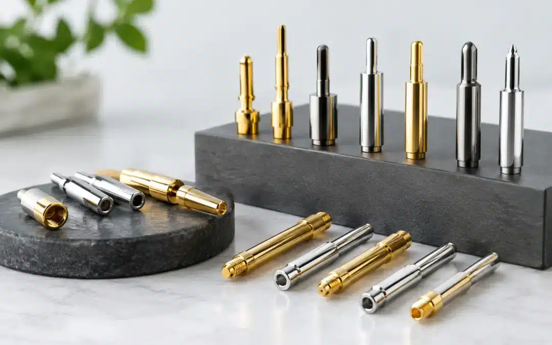
A great lapel pin design can lose its impact if the metal finish is wrong. The plating determines whether your custom pin feels formal, modern, premium, vintage or bold before anyone reads a word of your logo. This custom pin plating guide will help you choose a finish that suits your artwork, audience, budget and the occasion your pins are made for.
For a corporate recognition pin, polished gold may communicate achievement and value. For a sporting club or music event, black nickel can create a sharper, more contemporary edge. There is no single best option – the right plating is the one that makes your design clearer and reinforces the message behind it.
What pin plating actually does
Plating is the metal-coloured finish applied over the base metal of a die-struck or enamel lapel pin. It forms the raised outlines, borders and any exposed metal areas of the design. On soft enamel pins, the plating creates the walls between each recessed colour. On hard enamel pins, it frames the smooth, polished colour fill. On die-struck pins without colour, the plating becomes one of the most noticeable design features.
It affects more than appearance. A well-selected finish helps define fine details, gives a pin a consistent presentation across a large order and contributes to a durable, professional result. The plating choice also influences how colours appear beside it. Bright yellow enamel can look warm and traditional next to gold, for example, while the same yellow may look cleaner and more graphic against silver or black nickel.
For businesses, schools, clubs and community groups ordering in bulk, this is why plating should be considered early, alongside pin size, shape, attachment and enamel colours. Changing the finish after artwork has been approved can alter the whole look of the piece.
Custom pin plating guide: choosing the right finish
Start with the mood you want the pin to create. Then consider the practical details: your logo colours, the level of detail in the artwork, where the pin will be worn and whether it needs to match existing awards, uniforms or merchandise.
Gold plating
Gold remains a popular choice for recognition, anniversaries, fundraising, service awards and formal events. It has a warm, premium look that works particularly well with navy, burgundy, red, black, white and dark green enamel.
Polished gold is ideal when you want a clean, celebratory finish. It can make simple logos feel more prestigious without making the overall design complicated. For an association milestone badge or a school leadership pin, it is often an easy and effective choice.
The trade-off is contrast. Gold lines can be less defined against pale yellow, orange or metallic-looking artwork. If your design includes large areas of yellow, cream or warm tan, ask to see how the colours will sit against the proposed plating in your free digital proof.
Silver plating
Silver is crisp, versatile and easy to pair with most brand colours. It is a strong choice for corporate branding, healthcare, technology, education and modern event merchandise. A polished silver finish often gives pins a neat, contemporary appearance without competing with the artwork.
Silver works especially well with blues, greens, purples, bright reds and cooler colour palettes. It is also useful where a logo has fine linework, as the light metal colour can keep small details looking clean.
If your brand already uses chrome, stainless steel, grey or white across signage and uniforms, silver plating can make the pin feel like part of the same visual system. It is professional rather than flashy, which is exactly what many organisations need.
Black nickel plating
Black nickel delivers strong contrast and a modern, high-impact look. It is popular for streetwear-style pins, automotive brands, gaming events, sporting clubs, security-related organisations and designs with bright enamel colours.
The dark metal outlines make colours stand out, particularly white, neon shades, turquoise, red and bright blue. It can also help bold, simplified artwork look more graphic and memorable from a distance.
However, black nickel is not always the right fit for formal or heritage-focused designs. It can make a traditional crest, commemorative badge or elegant award pin feel heavier than intended. It is also worth remembering that very dark enamel fills beside black nickel may lose definition, especially in small pin sizes.
Antique gold, silver and copper finishes
Antique finishes are designed to bring out texture and depth. Instead of a bright polished surface, the recessed areas are darkened to create an aged, dimensional appearance. They are particularly effective on die-struck pins, 3D pins and designs with detailed engraving, patterns, dates or emblems.
Antique gold offers a heritage feel that suits commemorative pins, historical societies, service clubs and award medallions. Antique silver has a classic, understated appearance, while antique copper adds warmth and works well for rustic, artisan or outdoor-themed designs.
These finishes are usually best when the metal detail is the hero. If your pin relies on bright enamel colours and a very clean corporate look, polished plating will often be a better match. Antique effects can soften sharp contrast, which is a benefit for textured artwork but not always for a modern logo.
Copper and other specialty looks
Copper plating can provide a distinctive alternative to gold or silver. It has a warm, earthy character and can suit hospitality venues, local markets, creative brands, environmental groups and commemorative projects. It pairs nicely with forest green, deep blue, cream, black and muted reds.
Specialty finish availability can depend on the pin style, quantity and production method. If you have a particular look in mind, share reference images with your supplier rather than relying only on a finish name. Terms such as “rose gold”, “bronze” and “matte black” can mean slightly different things across manufacturing processes.
Match plating to your pin style
Plating decisions become easier when you consider how the pin will be made. Soft enamel pins use raised metal borders, so the finish is clearly visible and plays a major role in the final look. Hard enamel pins have a smooth surface, but their metal lines still create structure and contrast.
Die-struck pins without enamel rely almost entirely on plating, raised and recessed surfaces, and texture. Antique finishes are often a natural fit here because they make the stamped detail easier to see. For printed pins with an epoxy coating, the metal may be limited to the outer edge or backing, so the printed artwork usually takes priority.
Acrylic and PVC pins are different again. They do not use traditional metal plating in the same way, which may make them a better option for colourful illustrations, character designs or complex gradients where a metal outline is not required.
Design details that prevent costly surprises
Small pins need clear decisions. Fine text, tiny gaps and closely matched colours can become difficult to read once reduced to a 25 mm or 30 mm lapel pin. A dark plating may improve separation in some cases, but it cannot fix artwork that is too detailed for the finished size.
Keep metal lines sufficiently bold, especially around small colour areas. Consider whether your pin will be viewed up close on a blazer, lanyard or uniform, or from a few metres away at an event. A design intended for retail or fundraising may benefit from stronger contrast, while an executive recognition pin can use more restrained detail.
Also think about the attachment. A butterfly clutch is the common practical choice for most lapel pins, while magnets can protect delicate clothing and presentation boxes add value for awards or commemorative gifts. These choices do not change the plating itself, but they shape how premium the final item feels.
Use a digital proof to compare finishes
A free digital proof is the best point to check the relationship between plating, enamel colours, wording and scale. Review it at the actual pin size where possible, not only enlarged on a computer screen. Ask whether the finish is polished or antique, confirm which areas will be exposed metal and check that Pantone colour references have been supplied for key brand colours.
For larger campaigns, such as a national conference, club anniversary or staff recognition program, it can be worth comparing two finish options before production. Gold and silver may both work technically, but one will usually better support the tone of the event and the other branded materials being used.
At Lapel Pins Australia, hands-on guidance and a clear proof process help take the guesswork out of these decisions. You do not need to know every manufacturing term – you only need to explain what the pin is for, who will wear it and the impression it should leave.
The best finish is the one that makes your logo instantly recognisable and your purpose clear. Bring your artwork, preferred colours and deadline to the quoting stage, and allow the plating choice to turn a small badge into a polished piece people will be proud to wear.