
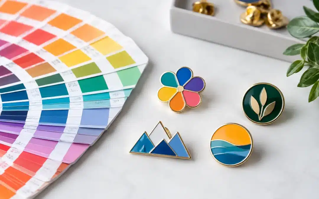
A lapel pin is small, but a slightly wrong brand colour can be surprisingly noticeable. Pantone colour matching gives your organisation a clear reference point, helping custom pins look recognisably yours whether they are handed out at a conference, worn by club members or presented as an achievement award.
For businesses, schools, charities and sporting clubs, colour consistency is part of a polished presentation. The right shade reinforces your logo and makes a bulk order feel considered, not generic. The practical part is understanding what Pantone can control, and where pin material, finish and production method can create natural variation.
What Pantone Colour Matching Means
Pantone is a standardised colour system used by designers, printers and manufacturers. Rather than describing a colour as “dark blue” or sending a screenshot that may appear differently on another screen, you provide a specific Pantone reference. That reference gives the production team a defined target for the colour fill in your design.
This is particularly useful when your logo contains a signature colour, when pins need to sit alongside existing uniforms or event materials, or when you are ordering merchandise over time. A club gold, corporate teal or school maroon should not change character simply because the item is small.
A Pantone reference is not the same as a promise that every surface will look identical in every light. A glossy enamel fill, a printed pin and ink on a letterhead all reflect light differently. The goal is a close, professionally managed match that retains the strength and recognition of your brand.
Why Pantone Colour Matching Matters for Pins
Custom lapel pins often carry very little artwork space. That means colour does more of the visual work. A clean, accurate colour fill can make a simple logo stand out from a distance, while a poorly chosen substitute can make fine details look dull or off-brand.
For an event organiser, consistent colours make staff, volunteers and VIPs easy to identify. For a charity, they help supporters wear a symbol people immediately connect with the cause. For a business, they make an inexpensive promotional item feel like a proper extension of the brand rather than a giveaway that has been rushed.
Pantone references also reduce avoidable back-and-forth during quoting and artwork approval. If you can supply your logo file with Pantone colours already specified, the designer has a stronger starting point. If you cannot, an experienced supplier can review the artwork and help identify the closest practical option before production begins.
Choose the Pin Style Before Choosing the Finish
The best colour result depends on how the pin is made. There is no single material that suits every logo, budget or deadline.
Soft enamel pins
Soft enamel is a popular choice for bold logos and commemorative designs. Coloured enamel sits slightly below raised metal outlines, creating a textured finish with clear separation between colours. The metal lines stop adjacent shades from bleeding together and give the pin a classic, durable look.
It works well for designs with solid blocks of colour and strong shapes. Very small text, gradients or photographic artwork may need a different approach. A close Pantone match is achievable, but the selected metal plating can change how the finished colour is perceived. Bright gold, antique brass, silver and black nickel all create a different visual frame around the same fill colour.
Hard enamel pins
Hard enamel is polished flat across the face of the pin, producing a smooth, premium finish. It suits corporate recognition pins, premium retail designs and badges that will be handled often. Because the finish is refined and level, simple branding and well-spaced detail tend to look especially sharp.
Hard enamel can cost more than soft enamel and may not be the best value for a large, simple giveaway. It is worth considering when presentation matters as much as volume, such as executive gifts, anniversary pins or formal association awards.
Printed pins with epoxy coating
Printed pins are often the smarter choice for detailed logos, fine lettering, gradients and designs with several shades. Artwork is printed onto the pin surface, then protected with a clear epoxy coating. This gives greater flexibility where enamel borders would make the details too small or crowded.
Printing can reproduce complex artwork more effectively, but it still requires realistic expectations. Colours may appear slightly different from a physical Pantone book because of the print process, coating and base material. A proof is essential, especially where subtle tones matter.
PVC and acrylic options
PVC pins are flexible, colourful and ideal for playful designs, mascots or youth events. Acrylic pins can be lightweight and cost-effective for simple promotional campaigns. Both offer useful design flexibility, although their colour appearance and edge finish are different from metal enamel pins.
The right choice comes down to the role of the pin. If it is an everyday membership badge, metal may offer the durable, polished look you need. If it is a high-volume festival giveaway, printed, PVC or acrylic options may offer better value while still carrying your colours clearly.
Artwork Makes the Match More Accurate
The most useful artwork file is a vector file, such as AI, EPS or PDF, with colours clearly defined. Vector artwork keeps edges crisp at different pin sizes and gives the production team clean shapes to work from. A high-resolution PNG can still help, particularly for printed artwork, but screenshots and small web images can make exact colour identification harder.
If you know your Pantone references, include them when requesting a quote. If your brand guide lists CMYK, RGB or HEX values only, provide those as well. They give useful context, though they are not a direct substitute for a Pantone callout on a physical product.
Be careful with tiny elements. A detailed logo that looks excellent on a computer monitor may need simplifying on a 25 mm pin. Fine lines can be widened, text can be enlarged and adjacent colours can be separated with metal borders. These changes are not a compromise on quality. They are how a design stays readable at pin size.
The Digital Proof Is Where Details Are Settled
A free digital proof gives you the chance to check the complete layout before manufacturing starts. Look beyond the logo itself. Confirm the pin shape, size, metal finish, colour callouts, border thickness, attachment and wording. If the design includes a background colour, make sure it supports the logo rather than competing with it.
When reviewing a proof, ask whether the pin will be viewed mainly from arm’s length or up close. A staff recognition pin may be inspected closely. A fundraising pin needs instant impact from a few steps away. That difference can affect the best size, finish and colour treatment.
It is also wise to nominate one person to approve the final proof. This avoids mixed feedback from a committee or marketing team and keeps your turnaround on track. Once production begins, colour and design changes are far more difficult to make.
Factors That Can Affect the Final Colour
Pantone colour matching is controlled carefully, but physical manufacturing has variables. Understanding them helps you make better decisions and avoid chasing an unrealistic screen-perfect result.
- Metal plating affects contrast. Silver and black nickel can make bright colours feel cooler, while gold and brass can make them feel warmer.
- Gloss, matte and epoxy finishes reflect light differently. A glossy surface can make a colour appear brighter under strong indoor lighting.
- Small coloured areas can appear different from large swatches. This is a normal visual effect, particularly with pale shades and fine details.
- Production batches can have minor variation. Ordering enough pins for one campaign at the same time is the best way to maintain close consistency.
- Screen settings are not a colour standard. Review the approved proof and provide Pantone references rather than relying on colours shown on a mobile or laptop.
For outdoor events and regular wear, ask about the most suitable material and finish for the job. A pin that is regularly clipped to a uniform, lanyard or cap needs to look good after plenty of use, not only when it first leaves the box.
A Better Brief Means a Better Pin
When you request a custom pin quote, include the quantity, preferred size, deadline, artwork, Pantone references and intended use. Mention whether the pins are for staff recognition, a school house system, a fundraiser, a sporting season or a trade event. That context helps the supplier recommend a suitable style instead of simply quoting the cheapest available option.
Lapel Pins Australia can guide you through colour, material, attachment and presentation choices, then provide a free digital proof before you commit to production. With more than 20 years of experience, the focus is on making the process clear and getting your pins ready for their purpose.
Your brand colours deserve more than a close guess from a screen. Send through your artwork and intended quantity early, allow time to review the proof carefully, and create a small badge that carries a big, unmistakably yours impact.