
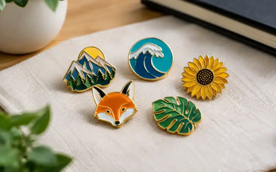
A trading pin has only a few seconds to win someone over across a busy sporting field, school event or collectors’ table. That is why knowing how to design trading pins is less about squeezing in every detail and more about creating one bold idea people recognise straight away. The best pins show team pride, mark a moment and give people a genuine reason to swap, collect and wear them.
For Australian clubs, schools, charities and event organisers, a well-designed pin is also practical branded merchandise. It can recognise players, build excitement around a tour or carnival, raise funds, and leave supporters with something far more lasting than a paper flyer.
Start With the Story Behind the Pin
Before choosing colours or finishes, decide what the pin needs to represent. A junior footy club heading to a state carnival may want a mascot, team name and tournament year. A charity event may need a simple symbol that supporters can wear proudly. An anniversary pin might focus on a founding date, heritage colours or a special milestone.
Keep this central message tight. Trading pins become stronger when they have a clear hero – a mascot, crest, player number, landmark, trophy or event logo. Trying to give equal weight to five separate ideas usually creates a small, cluttered badge that is hard to read from arm’s length.
Ask one practical question: what should somebody remember after seeing this pin once? If the answer is “the bright kookaburra mascot” or “the bold 50-year emblem”, your design has a useful direction.
How to Design Trading Pins for Instant Recognition
A pin is not a brochure. Fine copy, detailed photographs and long sponsor lists may look acceptable on a screen, but they rarely reproduce well at pin size. Most successful designs rely on strong shapes, clean contrast and limited text.
Make the main shape work for you
A standard circle, square or shield is cost-effective and suits many club logos. A custom outline can add more personality when the shape is part of the story. Think of a surfboard for a surf lifesaving carnival, a cricket bat for a touring side, or the outline of an animal mascot.
Custom shapes create stronger shelf appeal, but very thin sections, sharp points and complex cut-outs can affect durability and cost. If your logo has lots of narrow detail, a standard shape with the logo printed or enamel-filled inside may produce a cleaner result.
Choose a focal point, then build around it
Place the main graphic in the centre or slightly above centre, where the eye naturally lands. Supporting details such as a team name, location or year can sit around the edge, below the graphic or on a small banner.
Text needs breathing room. Use a bold, legible typeface and keep wording short. “Gold Coast Tour 2026” will read better than a full competition title, division name, club motto and list of sponsors all competing in the same space. If sponsor recognition is essential, consider a matching keyring, patch or separate event item rather than forcing everything onto the pin.
Use colour with purpose
Team colours are a natural starting point, especially for sporting clubs and school groups. Select one dominant colour, one or two supporting colours, and a contrasting shade for outlines or text. High contrast matters: white lettering on navy, black details on gold, or a bright mascot against a dark background are easier to identify quickly.
Pantone matching helps keep your branded colours consistent across pins and other promotional products. Still, colour alone should not carry the design. A clear outline and distinct silhouette help the pin stay recognisable when viewed in shade, under stadium lights or in a crowded collection.
Select the Right Pin Style and Finish
The material and production method shape how artwork is translated. The right choice depends on your design, budget, quantity and the feeling you want the finished piece to have.
Die-struck enamel pins suit bold logos, crests and mascot artwork. Raised metal lines separate the coloured enamel areas, giving the design texture and a premium feel. Hard enamel has a smooth, polished surface, while soft enamel retains more of the raised metal definition. Either can be a strong option for clubs and organisations wanting a durable, traditional trading pin.
Printed pins work well for detailed illustrations, gradients, fine lettering and artwork with many colours. An epoxy coating can protect the printed surface and add a glossy finish. This option is often the smarter choice when simplifying the artwork would remove too much character.
PVC pins offer a flexible, colourful style with moulded detail. They are popular for playful mascots, junior sport and designs that need a slightly softer look. Acrylic pins can suit bright, modern graphics and events where a lightweight, cost-conscious option is needed. For commemorative or executive presentation pieces, a 3D metal pin can add depth to a sculpted logo, building or emblem.
Do not choose a finish purely because it sounds premium. A detailed illustrated mascot may look sharper as a printed epoxy pin than as enamel. Conversely, a simple crest with two strong colours often looks more substantial in die-struck enamel. The artwork should lead the production decision.
Add Collectable Details Without Overcomplicating It
The pins people actively trade often include one memorable extra. This might be a glitter background, glow effect, translucent colour, glitter enamel, a spinner, a dangler, or a second layered piece. Used well, these features turn a standard badge into a talking point.
They also need to suit the audience and budget. A glitter ocean can make sense for a swimming club pin. A spinner might work for a cycling event or a playful school mascot. For a corporate conference or recognition program, a refined metal finish and presentation box may be more appropriate than novelty effects.
Limited editions can increase collectability too. Numbering a small run, creating a different pin for each competition year, or developing a set around several mascots gives members a reason to keep coming back. Be clear about quantities before production if scarcity is part of the appeal.
Plan Size, Attachment and Wearing Practicality
Most trading pins need enough surface area for the design without becoming heavy or awkward on a cap, jacket or lanyard. The ideal size depends on the artwork. A simple logo can stay compact, while a detailed scene may need more room to remain legible.
As a rule, simplify before making a pin oversized. Large pins can feel impressive, but they cost more, weigh more and may sit poorly on lightweight fabric. If you need to show several detailed elements, consider making a small collection instead of one oversized design.
For attachments, a butterfly clutch is a familiar choice for everyday lapel wear. Rubber clutches can be comfortable and secure, while magnets avoid piercing clothing and suit name badges or more formal uses. Larger or heavier pins may need two attachment points so they do not rotate or sag.
Think about who will use the pin. Young players swapping pins at a carnival need something durable and easy to handle. Volunteers at a gala dinner may value a polished finish and secure magnet. The best specification is the one that fits the real occasion.
Prepare Artwork That Manufactures Cleanly
Good source artwork makes the production process faster and the result more accurate. Vector files such as AI, EPS or PDF are ideal because lines and shapes can be scaled cleanly. High-resolution PNG or JPG files can also help, particularly for printed designs, but low-resolution screenshots and blurry social media images make it harder to achieve crisp detail.
If you only have a rough concept, that is still enough to start. A sketch, existing logo, colour references and a short explanation of what you want can guide the artwork process. Include the wording exactly as it should appear, preferred colours, expected quantity, target delivery date and any special features you are considering.
A free digital proof is worth reviewing carefully before production. Check spelling, dates, colour placement, proportions and small text. Look at the proof on a mobile as well as a larger screen. If details disappear at a smaller viewing size, they may need simplifying on the finished pin.
Avoid the Design Mistakes That Cost Time
The most common issue is asking a small pin to do too much. Fine lines merge, tiny lettering fills in, and subtle colour changes can lose impact. Simplifying does not mean making the design bland. It means protecting the features that make it recognisable.
Also allow enough lead time for artwork approval and manufacturing, especially before major tournaments, school terms, Christmas events or national conferences. Rushing the design stage can lead to preventable changes later. Order enough for players, staff, swaps, sales and a small reserve for late registrations or future collectors.
For a dependable result, share your purpose and budget early. An experienced supplier can recommend whether enamel, printed, PVC or acrylic is likely to deliver the strongest finish for your artwork and quantity. Lapel Pins Australia provides hands-on guidance and a free digital proof, so you can see the direction before your order moves ahead.
A great trading pin does not need to say everything about your organisation. It only needs to make people want to ask about it, wear it and swap it. Give it one clear idea, a confident shape and colours that belong unmistakably to your group, and it will keep working long after the event pack-up.