
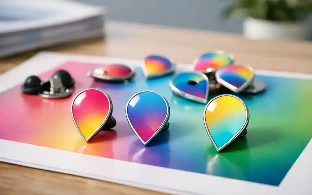
A smooth fade from your club colours into a sunrise, a bold event logo that shifts from purple to pink, or a campaign badge with a full-colour illustration can turn a small pin into something people genuinely want to keep. Printed pin gradients make that possible without forcing your artwork into separate blocks of colour.
For businesses, schools, sporting clubs and community organisations, the appeal is simple: you can carry more of your visual identity onto a compact, wearable item. The key is choosing the right pin style and preparing artwork that still looks sharp when it is reduced to lapel-pin size.
What are printed pin gradients?
A gradient is a gradual transition between colours. It may move from one shade to another, fade a colour into white, or blend several colours across an illustration. In printed pin production, the design is reproduced in full colour rather than being divided into individual enamel-filled areas.
This makes printed pins especially useful for artwork that includes soft shading, photographic detail, watercolour effects, sky scenes, tonal logos, complex mascots or colour fades that cannot be matched accurately with standard enamel colours alone. A printed surface can then be finished with a clear epoxy coating for added protection and a smooth, glossy appearance.
The result is a clean promotional pin with far more freedom than a traditional die-struck enamel design. It is not a replacement for enamel in every situation, though. It is a different tool for a different kind of artwork.
When printed pin gradients are the best choice
If your design depends on subtle colour changes, printing is generally the most practical option. An enamel pin can use close Pantone colour matches, but each colour is normally separated by raised metal lines. That construction creates a crisp, classic look, yet it is not suited to a continuous fade from one colour to another.
Printed pin gradients work particularly well for event artwork. Think fun runs with bright colour transitions, music festivals with atmospheric poster-style designs, school programmes with illustrated themes, or charity campaigns built around an emotional visual message. They also suit corporate brand marks where the official logo includes a gradient that should not be simplified beyond recognition.
They are a strong option for short-term campaigns and large-volume giveaways because they deliver visual impact while remaining cost-effective. For a membership pin, recognition badge or premium commemorative piece that needs a more traditional metal feel, enamel may still be the better fit. It depends on what recipients should notice first: detailed artwork and colour, or metal relief and tactile finish.
Designs that benefit from full-colour printing
A printed pin is worth considering when your artwork includes more than a few flat colours. This can include a detailed crest, a cartoon character with shaded areas, a landscape, a flag-inspired colour blend or a logo with fine internal detail.
It also helps when the design needs text over a coloured background. With thoughtful layout and enough contrast, print can preserve both the background effect and the message. For example, an awards pin can feature a graduated navy-to-teal background while keeping a white event name clear and easy to read.
There is one practical limit: pins are small. A gradient may print beautifully, but tiny text, very fine lines and subtle details can disappear if the chosen pin size is too small. Increasing the size by even a few millimetres can make a meaningful difference to readability.
Artwork tips for cleaner gradient pins
The most successful printed pins start with artwork designed for the final physical product, not just for a large screen or A4 flyer. What looks subtle and refined on a monitor can become muddy when reproduced at 25 mm or 30 mm.
Start by making the main message obvious. Your logo, event name, mascot or symbol should remain clear at arm’s length. Use the gradient to create atmosphere and movement, rather than making it compete with the focal point.
Contrast matters. Dark text over a light section of the gradient, or light text over a dark section, is easier to read than lettering placed across multiple tones with similar brightness. If the colour fade moves behind text, a solid backing shape, fine outline or carefully selected text placement can protect legibility.
Avoid relying on a very faint fade between nearly identical shades. It may be visible on your computer but barely register on a small printed pin. A slightly stronger transition usually produces a better result. This does not mean every design must be loud. It means the tonal change needs enough separation to survive the production scale.
Where possible, provide high-resolution artwork. Vector files are ideal for logos and linework because they can be scaled without losing definition. High-quality PDF, AI, EPS or SVG files are helpful, while sharp PNG files can also work for completed full-colour artwork. If you only have a JPG, send the best version available and ask for advice before production.
Choose a shape that supports the design
A round pin naturally suits circular logos, colour wheels, badges and central illustrations. Rectangle and square shapes provide more room for text, while custom shapes can follow a mascot, product outline, emblem or unique campaign icon.
The best shape is not always the most complicated one. A simple shape can make a colourful gradient feel more polished and easier to recognise. Custom outlines are effective when they add meaning to the design, not when they cut into key text or crowd the artwork.
Allow a safe margin around the edge as well. Important wording and details should sit away from the border, particularly on custom-shaped pins. This gives the production team room to position the artwork cleanly and helps prevent a cramped finish.
Epoxy coating: why it suits printed designs
Most printed pins are finished with a clear epoxy dome. This coating protects the printed face from everyday scuffs and handling while adding a polished, glossy finish. It can also make colours appear richer, which is ideal for bright promotional artwork and smooth gradients.
The trade-off is style. Epoxy-coated printed pins have a smooth, contemporary appearance rather than the textured metal-and-enamel character of a die-struck pin. For modern branding, youth events, colourful school programmes and campaign merchandise, that is often exactly what you want.
If your artwork uses a lot of black, deep navy or dark tones, the proof stage is especially useful. Small adjustments to contrast or line weight can improve how the design reads once the epoxy finish is applied.
Plan the pin around its job
Before settling on colours or finishes, consider how the pin will be used. A staff recognition pin worn with uniforms may need a restrained design and secure fastening. A fundraising item sold at a weekend market may benefit from an eye-catching full-colour graphic that stands out on a display card. An event pin handed out to hundreds of attendees needs to be clear, affordable and easy to produce in the required timeframe.
Attachment choice matters too. Butterfly clutches are a popular standard option for lapel pins, while magnet attachments suit garments where avoiding a pinhole is important. A larger or heavier pin may need an attachment setup that keeps it sitting neatly rather than twisting on fabric.
For organisations ordering in bulk, consistency is another advantage of working from an approved proof. Once the shape, size, colour treatment and attachment are confirmed, the same design can be reordered for annual events, new members, staff milestones or future campaigns.
Use the digital proof to get the details right
A free digital proof is the point where a good concept becomes a production-ready pin. Review it at the intended size, not only zoomed in on screen. Check spelling, logo placement, colour transitions, text clarity, border spacing and attachment position.
It is also the right time to ask whether an alternative size, shape or finish will strengthen the result. An experienced supplier can flag when fine text is likely to be too small, when a fade needs more contrast, or when a simple enamel option may better suit the artwork and budget.
At Lapel Pins Australia, the aim is to make custom pin ordering straightforward, whether you are organising a corporate activation, school event, club presentation or charity fundraiser. A well-prepared proof gives you confidence before bulk production begins.
A great gradient pin does not need to show every detail in your artwork. It needs to communicate one clear idea brilliantly. Keep the focal point strong, give the colours room to work, and let a quality proof guide the final refinements.