
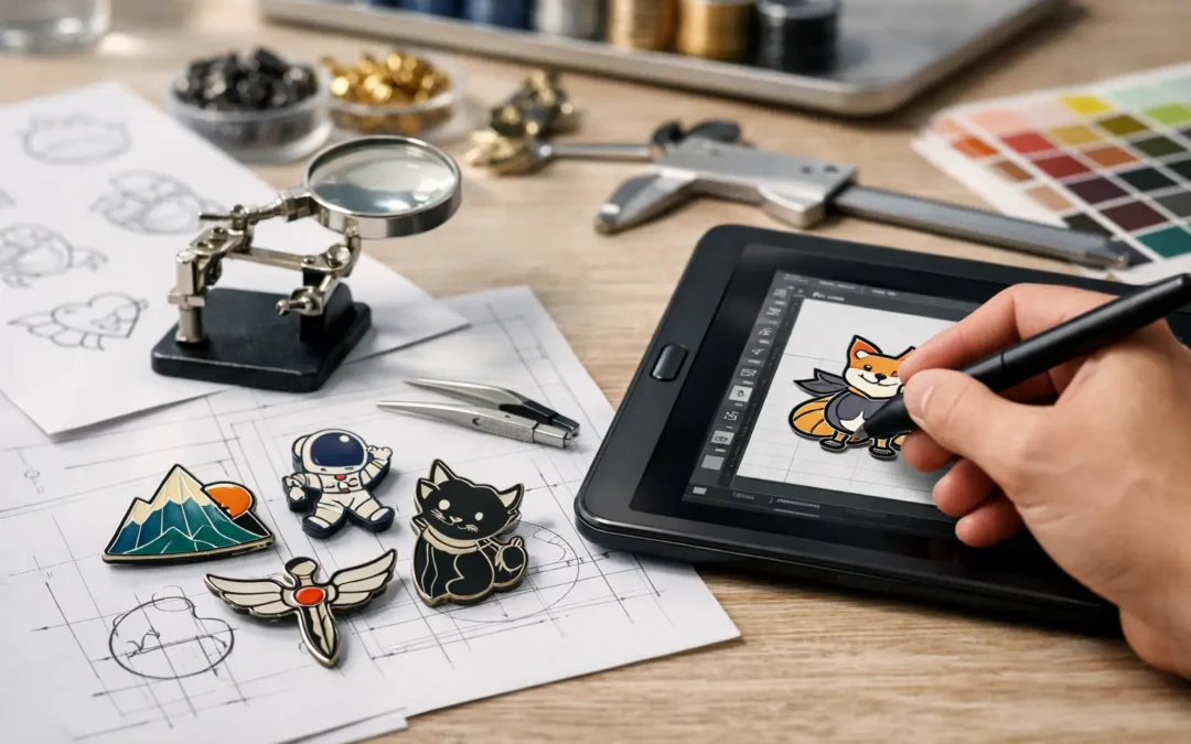
A lapel pin might be small, but every line, colour break and piece of wording has to work at a very small scale. Knowing how to prepare pin artwork before requesting a quote helps avoid production delays, unclear details and a finished pin that does not match the design you had in mind. Whether you are ordering pins for a business launch, school, sporting club, charity or event, clear artwork gives your project the best possible start.
The good news is that you do not need to be a graphic designer to supply suitable artwork. A clean logo, a clear brief and a few practical decisions about size, colour and finish are usually enough for an experienced pin supplier to create a production-ready proof.
Start with the clearest version of your design
Your original logo file is generally the best place to begin. Vector artwork is ideal because it can be enlarged or reduced without becoming blurry. Common vector file types include AI, EPS, SVG and editable PDF files. These files keep text, shapes and lines crisp, which makes it easier to convert your design into a die-struck, enamel or printed pin.
If you do not have vector artwork, send the highest-resolution version available. A large PNG, PDF or JPEG can still be useful, particularly for printed, epoxy-coated, acrylic or PVC pins. Avoid screenshots, images copied from social media, or tiny files pulled from an email signature. They can look acceptable on a mobile screen but may lose detail once enlarged for production.
If the only artwork you have is a rough sketch, an old badge or a low-resolution image, do not let that stop the project. It simply means the artwork may need more interpretation. Include a short note explaining which details matter most, such as the correct club colours, a particular symbol, or wording that cannot change. This gives the designer a clear reference when preparing your digital proof.
Choose a pin style before finalising fine detail
The production method affects what your artwork can realistically include. This is one of the most useful things to understand when preparing artwork for custom pins.
Die-struck enamel pins use raised metal outlines to separate coloured areas. They suit bold logos, badges, commemorative designs and strong graphic shapes. Because metal lines create the divisions in the design, very thin lines, tiny gaps and intricate text may need to be simplified. The result is durable, tactile and polished, but it works best when the artwork is clean and confident.
Printed pins are a practical option for artwork with gradients, fine illustrations, photographic elements or small colour transitions. An epoxy coating can add a smooth, glossy protective finish. If your logo relies on subtle shading or has several small details that would be difficult to reproduce with metal borders, printed pins may be the better fit.
Acrylic and PVC pins also allow different creative approaches. Acrylic can suit colourful promotional artwork and event designs, while PVC is flexible and works well for bold, dimensional shapes. Three-dimensional metal pins can add depth to a crest, mascot or feature element, although they are not always the right choice for designs containing extensive small text.
The best option depends on the design, the quantity, the intended use and your budget. It is often better to choose a pin style that supports your artwork than to force a complicated design into a process that cannot show it at its best.
Set the right size for readability
Pin size is not just a pricing decision. It determines whether people can recognise the logo, read the wording and appreciate the detail from a normal viewing distance.
For many branded lapel pins, a size around 25 mm to 32 mm works well. This is large enough for a logo or simple emblem while remaining neat on a jacket, uniform, lanyard or presentation card. A smaller pin can be effective for a very simple mark, but it may require reduced detail. Larger pins create more room for text and illustration, though they can feel less traditional as a lapel accessory.
Before approving artwork, ask yourself one direct question: can someone understand the design without holding it right up to their face? If the answer is no, consider enlarging the pin, reducing the amount of text or removing secondary visual elements.
Text is the usual trouble spot. A business name, anniversary year or short slogan may reproduce well, but a full mission statement, website address or several lines of tiny copy rarely belongs on a lapel pin. Keep essential text prominent and use a simple, legible typeface. Fine serif fonts and narrow script lettering can lose clarity, especially on small enamel designs.
Specify colours clearly
Brand colours matter, particularly when pins are part of a corporate uniform, marketing campaign or membership program. Provide Pantone references if you have them, along with your logo files. Pantone matching offers the closest practical match for custom colours across production.
If you do not know your Pantone colours, provide the best available artwork and identify any colours that are non-negotiable. A navy blue may have several possible interpretations, and a bright gold can vary significantly from one screen to another. Stating that a colour should match an existing uniform, signage or printed brochure can also help guide the proofing process.
Keep in mind that metal finishes influence the overall look. Gold, silver, antique brass, black nickel and other plating options can change the contrast around your colours. Bright yellow enamel, for example, may stand out beautifully against black nickel, while a formal corporate crest may look more traditional with polished gold or silver plating.
For enamel pins, each colour area is separated by metal. Aim for clear blocks of colour rather than very subtle tonal shifts. If gradients are central to the design, printed pins will generally give a more accurate result.
Build in sensible borders and spacing
Artwork that looks balanced on a webpage can need adjustment for a pin. Details placed too close to the outer edge may feel cramped or become difficult to manufacture cleanly. Leave a little breathing room between text, internal elements and the pin border.
This does not mean every pin needs to be round or rectangular. Custom shapes are one of the strongest ways to make a pin memorable. A mascot outline, state silhouette, product shape, shield or unique logo contour can create real impact. The key is to keep the outer shape smooth enough to look intentional and comfortable to wear.
Internal lines should also be strong enough to hold their place. On die-struck designs, raised metal lines need enough width to separate enamel areas clearly. Very narrow gaps, tiny isolated dots and hairline strokes are likely to be adjusted during proofing. Those changes are not about losing your design – they are about making sure it remains clear and durable once manufactured.
Include the details that affect the finished pin
A good artwork submission is more than an image file. Add a brief production note with the intended pin size, preferred quantity, pin style if known, colours, metal finish and any special requirements. If you need magnets instead of butterfly clutches, or presentation gift boxes for an awards event, say so at the beginning.
It also helps to explain how the pins will be used. Pins for staff recognition may need a premium finish and individual packaging. Fundraising pins may need to prioritise affordability at higher quantities. A large event order may have a fixed delivery date, so the design and proof approval need to happen early. Context helps your supplier recommend the right balance of visual impact, durability and cost.
For designs with multiple versions, label each file clearly. For example, use names such as “Club Crest Gold 32mm” and “Club Crest Silver 32mm” rather than “final final 2”. It sounds simple, but clear file naming prevents confusion when several people are approving artwork.
Review the digital proof carefully
The digital proof is your opportunity to check every production detail before manufacturing begins. Review the spelling, punctuation, dates, colours, pin shape, dimensions, metal plating and attachment type. Compare the proof against your original logo and make sure any simplified details still reflect the identity of your organisation.
Do not approve a proof based only on the overall look. Zoom in and check small wording, especially names, award years and event dates. If the design is for an annual program or milestone celebration, a single incorrect digit can turn a polished order into an expensive problem.
At Lapel Pins Australia, a free digital proof gives you a clear visual reference before production. Use it as a practical checkpoint, not a formality. Ask questions if something is unclear and request amendments before giving approval. It is much faster and more cost-effective to refine artwork at proof stage than after pins have been made.
Keep the purpose visible in the design
The strongest pin artwork is not always the busiest. A recognisable logo, confident colour choice and one meaningful visual detail can do more for your brand than a crowded design trying to say everything at once. That applies equally to a corporate campaign, a school house badge, a volunteer thank-you pin or a club membership emblem.
Prepare the best artwork you can, then let the pin’s size and production method guide the final refinement. With a clear brief and careful proof approval, a small badge can carry a big message long after the event, campaign or presentation is over.